Tips for Editing Espresso 2.0 Vinyl Background
Today I’m sharing tips for editing Espresso 2.0 vinyl background to remove unwanted blue tones (or any unwanted tones for that matter).
I also have a fun and helpful tip for subscribers to my newsletter on how to make the most of the breadboard you have, not the breadboard you want. Coming June 17th.
Espresso 2.0
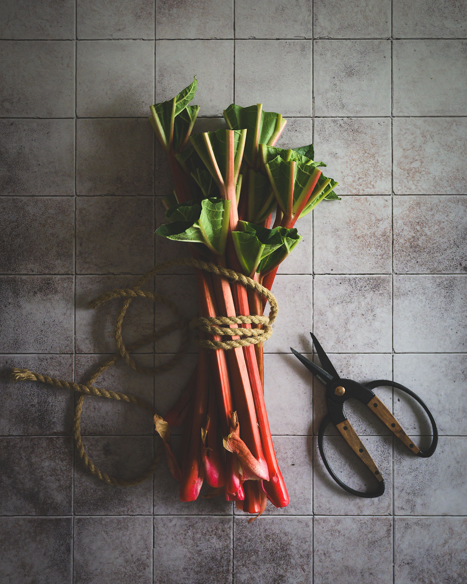
Our Espresso 2.0 vinyl background with its chocolate and cream hues appears to be almost black. It gets its name from the beloved coffee, and really does look similar to a cup of dark coffee with yummy cream swirling throughout. It boasts beautifully wide reclaimed wooden boards and if you’re looking for a warm and comforting background, this is it!
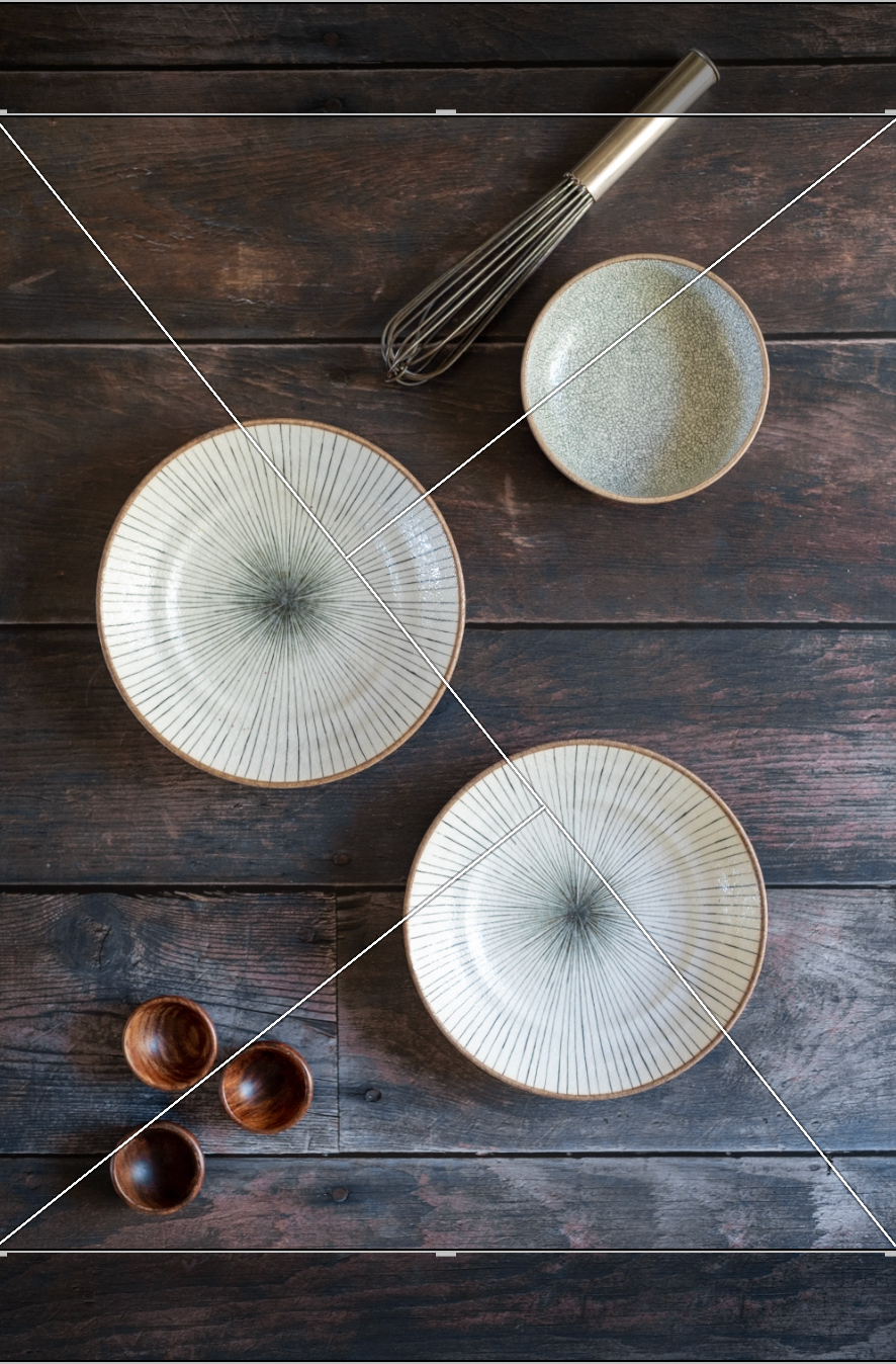
The following image is my final image, and one I’m quite pleased with—but first, isn’t that bread just SO beautiful?! It was a gift from a friend so it had to be documented.

What to do if your image has a blue cast
Except for cropping to a 4×5 ratio and straightening lines, the following photo is untouched.
It looks pretty good, but it could be better. I sometimes find when using Espresso 2.0 there can be a blue cast captured in camera even though there are no blue tones in the actual background. I captured this image in the morning and using a blue serviette added to the bluish cast.

This can happen with any type of background no matter the material. All monitors display colour and brightness differently, and when you are shooting your own images, different light situations result in different tones: morning light is blue (cool), afternoon and evening light is yellow (warm).
I preferred this image to be warmer, and I’ll walk you through my editing process.
Lightroom Edits
I use Lightroom to edit my images, but these suggestions are for any and all types of editing programs.
Here is what you’ll need to do:
Step 1
Adjust the temperature to increase the warm tones
Step 2
Decrease the blue tones
Step 3
Decrease the magenta and purple tones
Step by Step Instructions for editing Espresso 2.0
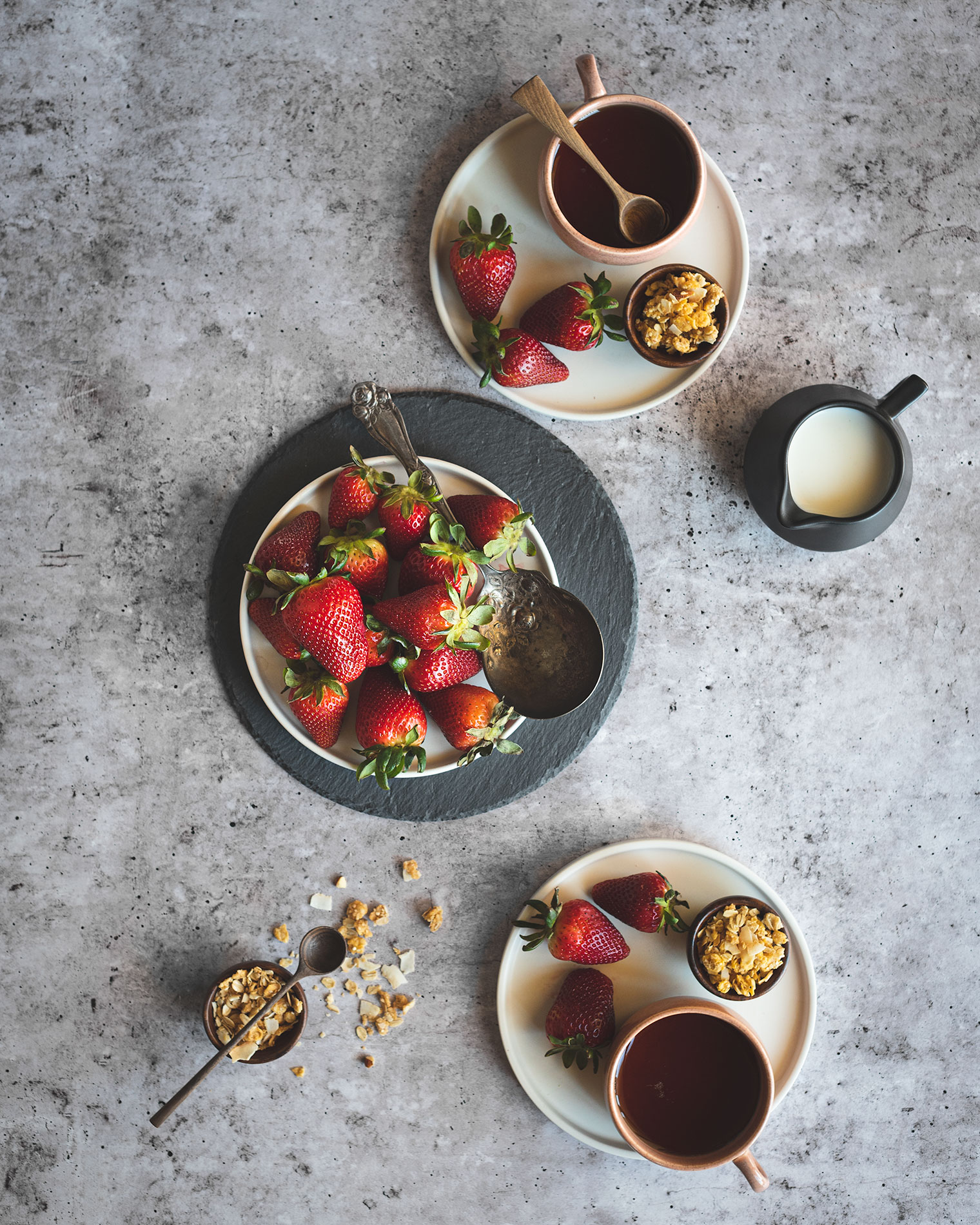
Step 1: Adjust the temperature to increase the warm tones by moving the slider to the right. This will automatically tone down most of the blueish cast.
In the Develop Panel (Basic), I moved the temperature up from 4,850 to 5,615

Step 2: Decrease the blue tones by moving the Blue Saturation slider to the left
In the Develop Panel (Color Mixer), I moved the Blue Saturation to -21:

Step 3: Decrease the Magenta and Purple tones. I didn’t want any purple or magenta tones in my image, so I decreased the Saturation for both by -100:


Can you believe just how easy that was? Just a few tweaks in your editing program results in a pleasing final image!!
Thanks for being here and don’t forget to subscribe to my newsletter for extra tips!

Subscribe to my newsletter to gain access to the Freebie Library!
Subscribe to receive Shop updates. Once subscribed you’ll gain access to the Freebie Library where you’ll find subscriber-only downloadable wallpapers and a calendar/planner. New content is added regularly.
Barb,
Thank you so much. I can’t wait to try this out. I wonder if it will work
On white background also. I saw that you wrote another blog recently. I love ❤️ your blogs. Thank you. Are you announcing them? Ann
Hi Ann, I’m so glad you stopped by and found this helpful! I plan to send out a notice with my next newsletter xo